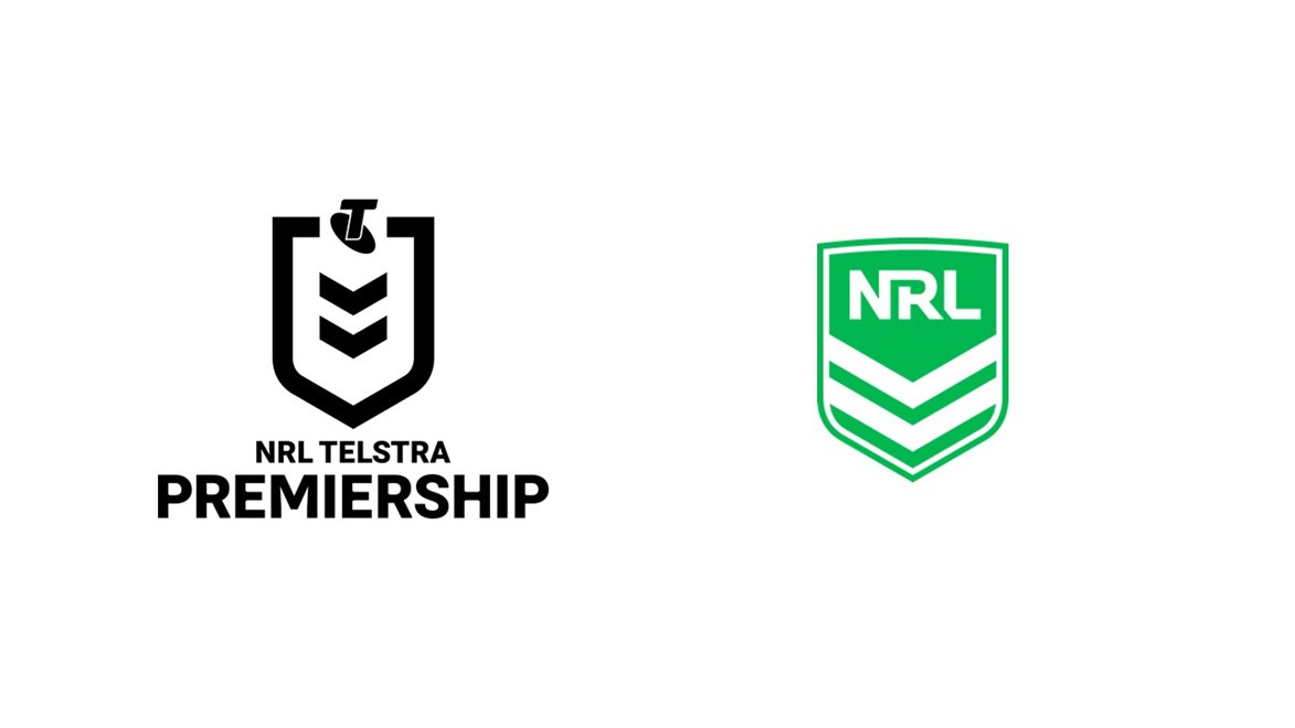

The NRL is set to launch a bold new look for its Telstra Premiership.
The new look aims to modernise the Telstra Premiership brand as well as integrate it more seamlessly with the 16 clubs.
The new brand, highlighting the shield and the chevron - which have both been synonymous with Rugby League since the games inception - will be formally unveiled when the NRL Telstra Premiership 2019 schedule is announced later this month.
The shift follows an extensive research and consultation process which began in 2017, and included extensive focus groups with key stakeholders including fans, Clubs, partners and media.
The refreshed simple and modern design, developed in conjunction with brand and design agency WiteKite and research agency Futures Sport, will be far more adaptive to digital environments, and is designed to attract new audiences. The refreshed look will encompass a full design refresh that contemplates everything from ball to broadcast.
The Telstra Premiership logo will now be distinctly different to the NRL corporate logo – one of the key callouts from the research carried out across the process.
“The Telstra Premiership is competing with far more than just other sports,” NRL CEO Todd Greenberg said.
“It competes in the world of entertainment, which is a highly competitive landscape. And whilst the Telstra Premiership competition is undoubtedly one of Australia’s most exciting and entertaining experiences for fans, we need to ensure our brand evolves with this changing landscape.”
NRL General Manager of Brand and Marketing Peter Jarmain said the NRL undertook extensive fan feedback when deciding on the new look.
“It was important that we keep the shield and the chevron, which have such historical significance for the code,” Mr Jarmain said.
“But the aim was to modernise those very important symbols.
“The new design is more youthful and contemporary, to help the game connect to a younger fan base.
“But it also allows us to be integrated seamlessly with the 16 club brands, where the true point of connection lies for fans.”
South Sydney Rabbitohs CEO Blake Solly said the Clubs supported the new brand, particularly the strong integration with the Club network.
“One of the key benefits of the refreshed design is the ability for the brand to be more closely integrated with the club brands.” Mr Solly said. “This is a change in direction and a welcome one. We have 16 wonderful club brands; and this closer integration will help reinforce the connection between fan, club and competition.
“Ultimately, we want more people engaged with our great game. A more modern and progressive look, can only help that.”
Melbourne Storm CEO Dave Donaghy said the game continues to grow with the changing sport and entertainment landscape.
“The new look is simple, modern and clean – something that aligns with the Storm’s own recent new brand refresh,” Mr Donaghy said.
“Importantly, it helps to position the game in the increasingly competitive market to retain and attract fans in the future.”
